
 I’ve never found the 1970-71 Topps/OPC design to be particularly effective. It might even be the ugliest design they ever came up with. I think it’s certainly top five, anyway.
This is unfortunate, since as I showed a long time back, the iconic 1971 baseball set is basically a reworked 1970-71 hockey.
I was never really happy with my final result for that experiment, so I’m trying again with what I hope will be better results.
The Orr card from that year seems to be one of the better ones, so I’ll start with it again.
The first step for converting this set is to flip it vertically and reorient the text. That, fortuately is easy and is well-within the scope of my abilites.
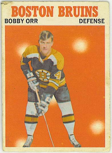
I think this is a little better already.
The next step is to get the colouring correct. Take all the white stuff and make it black, then take all the black stuff and make it white. The tricky bit comes with the team name, which is orange/red, and turns into a light blue if one simply inverts all the colours, as I hoped would work. Trying to keep this as orange-red led to a really painstaking pixel-by-pixel colouring job. There must be a better way, but I can’t find it. The problem is that the colours aren’t all that true, so I can’t select by colour.
Anyway, I wound up with this:
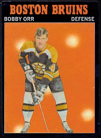
All in all, it’s not bad and it’s better than my first go a couple years back, but I find the orange background kind of garish. It’s harder on the eyes against a black border than against the white. The thing that works so well with the 1971 ball cards is that they are all up against a photo with a natural background.
Imagine if Topps/OPC instead went with something like this:
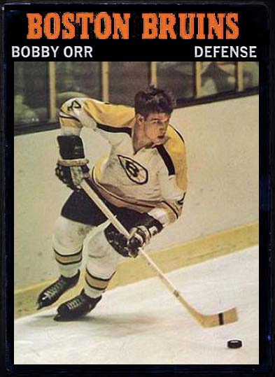
Now we’re talking. That would be a serious set to collect.
I’d buy it, anyway.

Now that is a nice looking card! Huge improvement there.
Thanks! I wish I knew how to print these things. That’s one I’d stick in the binder. 🙂
That is a pretty slick looking design! I’d be in for a few of those as well…
Nice job, you’re hired!!