
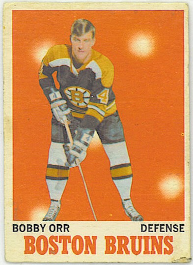
I have a nicer version of this card. I really should scan it.
Fixing the 1970-71 Topps/OPC hockey set is becoming a minor obsession. All the way back here (images on the link are dead, so it’s of limited use until I fix them) I noted that the set was basically an inverted 1971 baseball and in this post I got it into a nice looking card (in my opinion, anyway), but my inability to fix the text of the team name really irritated me.
The problem with the text is that either the ink isn’t 100% evenly applied or the process of compression the image into a jpg muddies the borders. Either way, those letters can’t be selected in a photo-editing tool in such a way that the lines actually wind up straight. When I tried it in the past, what I wound up with was this:
It feels so much better, but it’s not quite right.
It took quite a lot of effort to get the letters even to be that good and it became clear when I went after it again that no amount would ever get it looking quite right. I was stuck with trying to find an appropriate font and making the best of it.
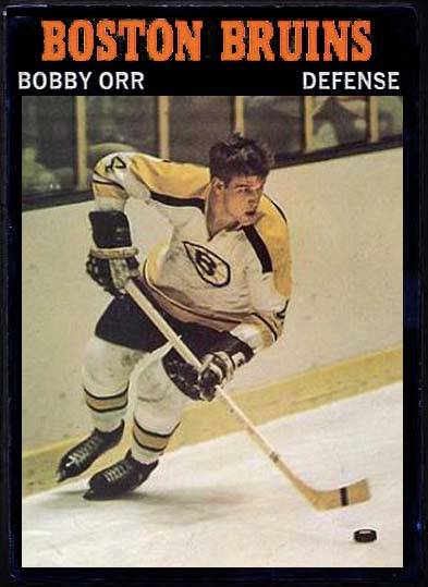
After some trying, I hit on this. The font is “Lucida Bright” in a demibold, 30-point.
Cleaner, anyway
It’s cleaner and not inappropriate. I was almost happy with it, in fact. It just lacked a little, I don’t know, call it pizzazz. I monkeyed around a little bit before hitting on something called “Informal Roman.” It’s kind of arty and wispy and I like it.

Now, we’re cooking
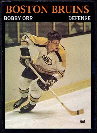
Is ti to everyone’s taste? Dunno, but I like it. To test the design, I took another ’70-71 of some prominence:
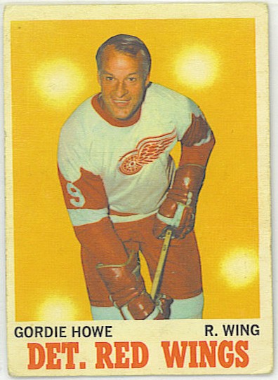
Again, I have a better one and should have scanned it, but no matter. All it was doing was donating some text. Gordie, reworked, gives me this:

I like it.
This is why I like the Informal Roman. For whatever reason, I think “DET. RED WINGS” looks awful in the Lucida Bright. It works OK for Boston, but not Detroit. This, I like.
And one more for the moment. I didn’t have this scanned at all, so I scooped one of the internet. This works well, too:
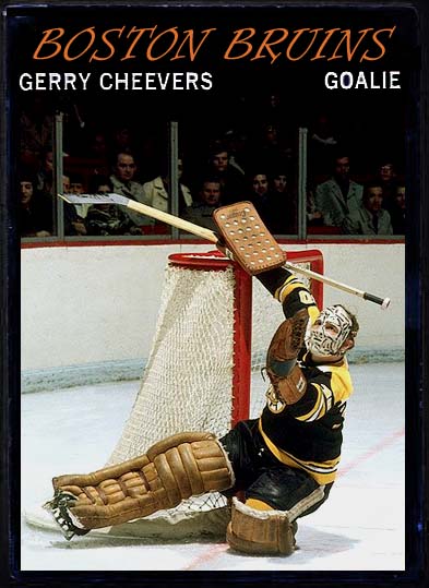
I like this better than any card Cheevers ever had, actually.
I think I might end up trying to make a bunch more of this set. It’s kind of cool, really. These cards desperately needed action shots.

Those cards are nicer than any of my actual ’70s hockey cards by a long shot. I’ve always wished there were more action shots on vintage hockey cards…
Me too. There were a lot of baseball card things that should have made it to hockey sooner (though really, action got to both near the same time)
I like the new design.
Thanks!
Wow, that Cheevers! I like it a lot.
I’ve got one coming that will be right up your alley. 🙂
Great cards! I’m an OPC collector from the 60s & 70s, thoroughly enjoy your efforts! Thanks..